Pro Tips – Heather Held
We are delighted that Heather Held has shared with us her insights this month. Heather has some pro tips for embellishing your floral flourishes with pastels.
One of my favourite embellishments for my floral flourishes is a soft pastel background. A careful application of pastel can really soften the look of offhand flourishing and make your work look more polished.
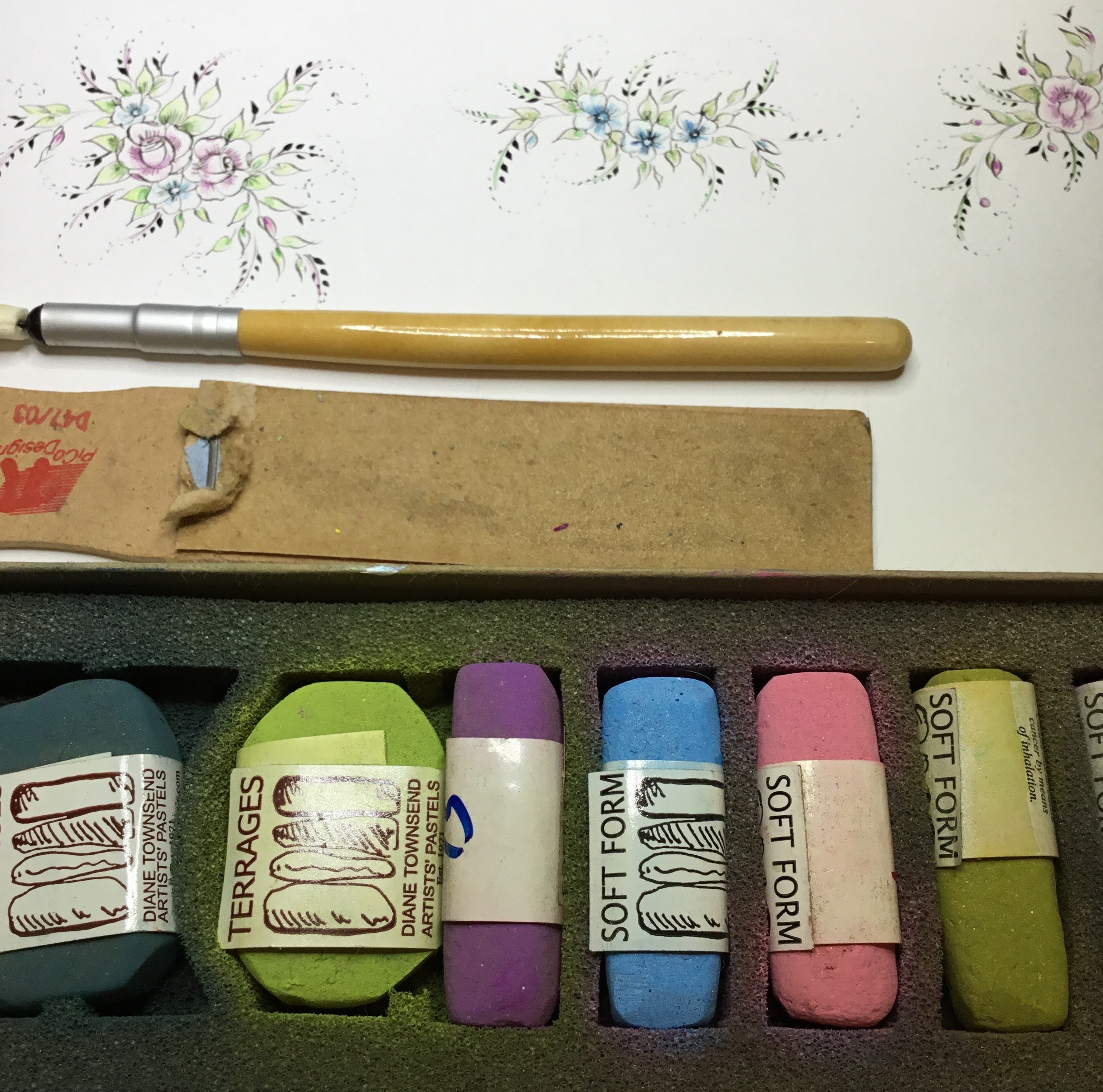
The pastels I use exclusively are Diane Townsend Pastels. They are available as sets or open stock. They have a range of very soft metallic colours as well as variety of bright and earth toned pigments. The pastels are created with the highest quality pure pigments. No chalky fillers are added. A small amount of gum is added as binder as well as pumice. It is the addition of pumice that makes these pastels a dream for our calligraphic work. The pastels can be burnished into the paper without any oily or chalky residue.
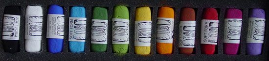
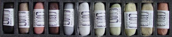
This allows the artist to add pen work on top of the burnished the background. Diane Townsend pastels are handmade in small quantities. There can be small differences in colours between one batch of pastels and another. I prefer to buy my pastels open stock where I can select the colours that I will be using most often. You don’t need to invest in a large quantity of these pastels. Our application method for using them means that a little goes a long way and will last a long time. I have been using mine for over 5 years and still have plenty to use. I suggest buying a soft green, a shadowy blue colour and one or two of your favourite colours that you like to use in your work. Primary colours are available in sets as well as her line of Metallic pastels. The Metallics are very soft and tend to crumble a bit, so be gentle with them. Because I use a lot of pinks, greens and blues in my work, I purchased those colours in the largest form of the pastel called Terrages. The medium size pastel is Softform and there is a very small almost tester size of the pastel called Thinline.
Some of my favourite colours are:
170 ( blue/grey)
163 (light yellow-green)
13: (lavender)
94: ( medium pink)
30L: (medium blue)
153 ( pale green)
607 ( green metallic)
604 ( bronze metallic)
605( gold metallic)
Application Method:
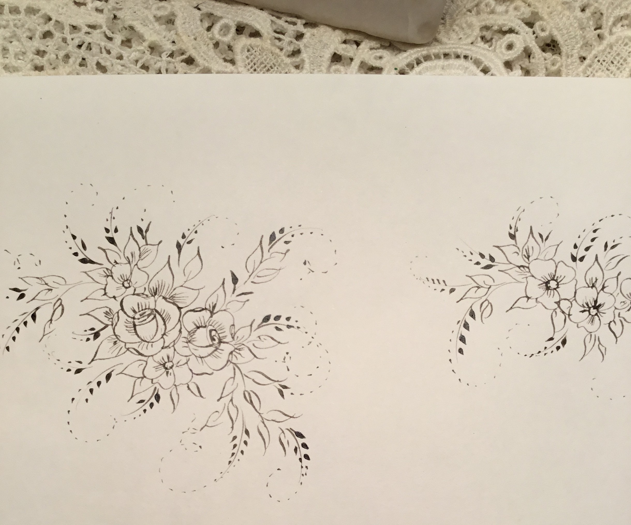
I start with a floral flourish. For this demonstration I chose McCaffery Black ink on Maruman Imagination paper. Although Maruman paper was used for this demo, these pastels work brilliantly on watercolour paper of any texture, the Strathmore 400 Series drawing paper and even Bristol Vellum. Experiment with your paper supply at home.

Once the ink had dried, I added a light application of Derwent Colorsoft coloured pencils to the black and white flourish. The coloured pencil already begins to soften the design.
I selected pastel colours that were similar in tone and intensity to the colours used in the flourish. I used a light yellow green Terrages ( colour 163). I use a small sandpaper block to catch the pastel pigment that I will apply to the paper.
Just a tiny bit is all that is needed. I use a pan pastel applicator tool to apply the pastel to the paper but a q-tip or eye make up applicator will also work. You will have to change the q-tip for larger projects as the sandpaper block will damage the end of it.
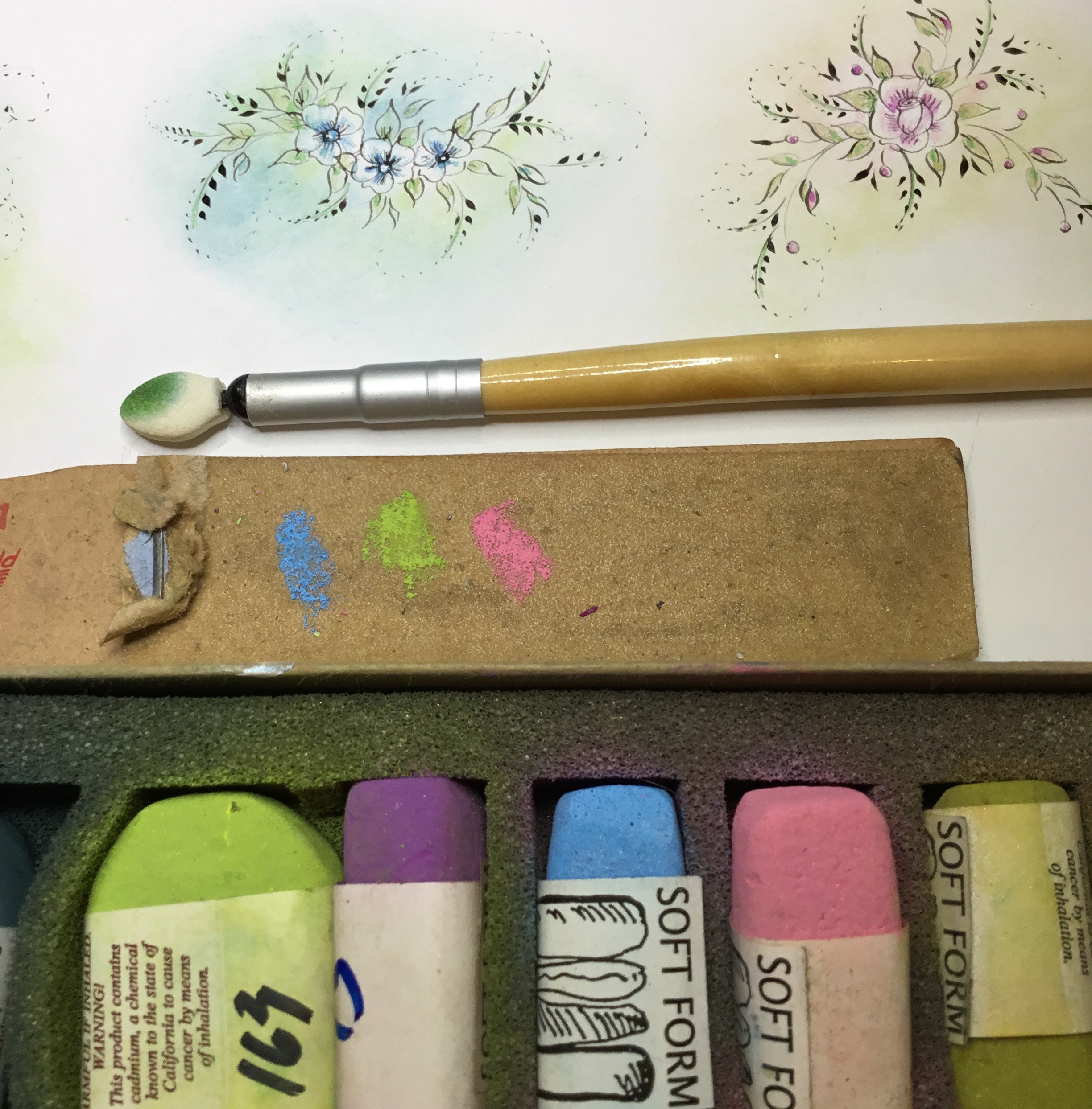
I applied the colours in circular motions around the floral flourish. It creates a soft cloud of colour. This effect can meander anywhere you want around the page. It can create a soft border of colour to frame your work very quickly. If you ever apply too much colour, you can pull the pastel off with a kneaded eraser. Colours blend beautifully together without looking grey or muddy.
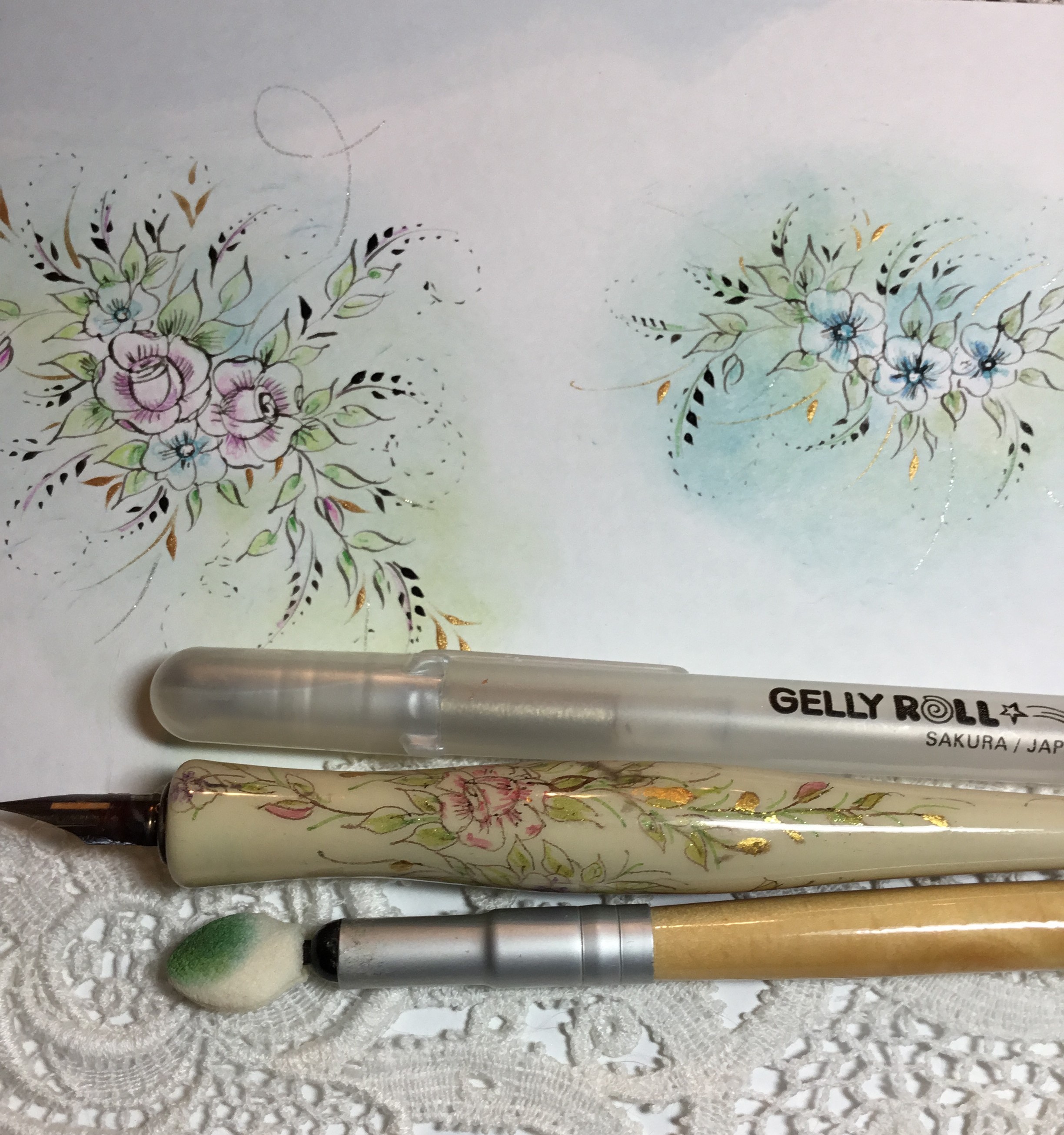
I embellished directly over top of my pastel burnished background with FineTec Gold watercolour that I thinned with water and applied to the back of my pen point. I waited to apply the gold after the background burnish so that the pastel will not dull the gold. Sakura Clear Stardust gelly roll pen was the final touch on the flourishes to add a little shimmer.
Enjoy playing with these beautiful pastels and watch how they bring your pointed pen flourishes to life.
Heather Victoria Held, April 2016
All of the products Heather talks about in this post are available on johnnealbooks.com, we have set up a special page for easy one stop shopping. Click HERE to check it out.


I’ve never used these, but you have convinced me that I need to try these out. Heather you have such a generous and loving way of teaching!
Oh, thank you, John Neal and Heather Victoria Held. Thanks for the ‘whys’ and the ‘hows’ for using these beautiful pastels.
This Pro Tip with Heather Held was FABULOUS!!! Keep these coming….I learned so much and will order the pastels when you get them in the colors that Heather uses!! What an amazing idea…KUDOS to whomever thought of this!!
You have a giving soul…….thank you for all you share.
These look amazing! Thanks for sharing
Thanks for the inspiration! What type or types of burnishers do you use?